

Picture walking into a small shop where the owner looks up, smiles and points you straight to what you came for. You leave feeling looked after, and the visit took almost no effort. A website can give people that same feeling. When a business invests in web design in Melbourne, colours and photos tend to win the attention, yet the real kindness of a good site is that visitors never feel lost on it. That comfort comes from planning, and any business can learn how to build it.
What Website Structure Means
Website structure is the way your pages are grouped, named and connected. It covers the main menu, the order of sections, the links inside articles and the wording of each web address.
A hardware store offers a helpful comparison. Shelves are sorted by category and signs hang above every aisle, so a customer can find a drill without asking anyone. Menus and page titles do the same job online.
Why Structure Matters to Visitors and Search Engines
Visitors judge a website quickly. If the page they need takes four or five attempts to reach, some will leave and try a competitor instead.
Search engines have a similar need. Google’s SEO Starter Guide explains that its crawlers find pages by following links, and that clear navigation helps people move from general content to the specific page they want. A tidy structure therefore serves readers and search engines at the same time.
Start With Your Customers’ Questions
Menus built around internal departments rarely suit visitors. Nobody outside a company knows what separates its “Solutions” team from its “Client Services” team, so labels like these cause hesitation.
A better starting point is the list of questions customers actually ask. Your inbox, phone calls and sales team can all supply it. A physiotherapy clinic, for example, may find that people keep asking about appointment times, health fund rebates and parking.
Once the list is ready, sort similar questions into groups. Each group usually becomes a main section of the website.
Draw a Sitemap Before Any Design Begins
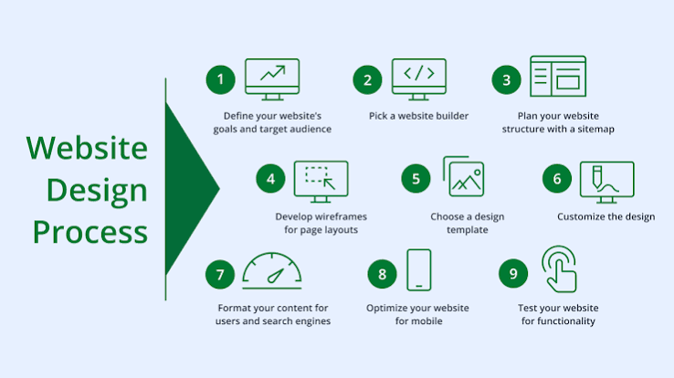
A sitemap is a simple outline of every page and the way those pages connect. Many sitemaps use three levels:
- Level one: the homepage
- Level two: main sections such as Services, About and Contact
- Level three: individual pages, such as one service or one article
Keeping important pages within three clicks of the homepage is a practical guideline. A page placed five levels deep is harder to reach, so ask whether it belongs higher up.
Keep Menus Short and Familiar
Short menus are easier to scan, particularly on a phone. Five or six labels usually cover the essentials, and anything extra can sit in a dropdown or the footer.
Menus also need to behave the same way on every page. The W3C’s Web Content Accessibility Guidelines require that navigation repeated across pages appears in the same order each time. That predictability helps everyone, and it is especially valuable for people using screen readers or keyboards.
Build Categories That Do Not Overlap
Large sites, such as online shops, depend on categories. A good category has a clear boundary, so a visitor can tell where a page belongs without guessing.
Card sorting is an easy way to test this. Write each topic on a card, ask a few people to sort the cards into groups, and note where they place each one. If most put “Warranty” under “Support” while you filed it under “Products”, the group has shown you a better home for it.
Connect Pages With Internal Links
Menus are only one route through a website. Links inside your content lead readers to related pages and keep them moving. An article on pricing, for instance, can point to a page about how the design process works for readers ready to take the next step. Useful internal links follow two habits:
- The link text describes the destination.
- The linked page adds to the current topic.
Plan for Phone Screens
Phones account for a large share of web browsing, so the structure should work on a small screen first. For anyone planning web design in Melbourne, testing the menu on a real phone reveals problems that a desktop preview hides.
Tap targets and headings matter here. The Web Accessibility Initiative at the W3C advises using headings and spacing to group related content, which helps readers scan a page and find the part they need.
Winding Up
Begin with a small exercise this week. Write down the ten questions customers ask most often, then count how many clicks each answer takes to reach on your current site.
Any answer sitting more than three clicks deep is your first candidate for a new position. Sketch a revised sitemap, show it to three people outside your business, and adjust it before any visual design starts.
If you would like support turning a site plan into a working website, our expert professionals at Make My Website can guide you through structure, design and build.
