

A personal color palette is more than a collection of attractive shades. It is a coordinated selection of colors that complements your natural features and helps create balance between your clothing, makeup, hair, and accessories.
Ever notice how certain colors make your complexion appear brighter while others seem to wash you out? The difference often comes down to skin undertones, color temperature, contrast, and saturation.
Understanding these characteristics can make everyday styling easier. Instead of following every trend, you can develop a color palette that reflects your appearance and personal preferences.
What Is a Personal Color Palette?
A personal color palette is a selection of colors chosen to complement your skin tone, undertone, hair, eyes, and overall coloring.
In fashion and beauty, palettes help coordinate clothing, makeup, and accessories. For example, someone might build a wardrobe around warm beige, terracotta, olive green, and chocolate brown.
The word palette also refers to a painter’s mixing surface or a coordinated collection of colors used in design.
Personal palettes apply similar color principles to everyday styling.
Palette vs. Palate vs. Soft Palate vs. Pallet
These words sound identical but have different meanings.
- Palette: The correct word for colors; in art or design, it can mean an artist’s board used to hold and mix paint or a set and range of colors.
- Palate: The word palate means the roof of the mouth that you can touch with your tongue or, in a broader sense, someone’s taste, especially for food that is pleasing.
- Pallet: By definition, a pallet is a wood slab or board for carrying things or cargo, often moved by a forklift or other vehicle.
When discussing makeup, fashion, or color analysis, palette is the correct spelling in writing, and sentence examples about shades or color choices use this term.
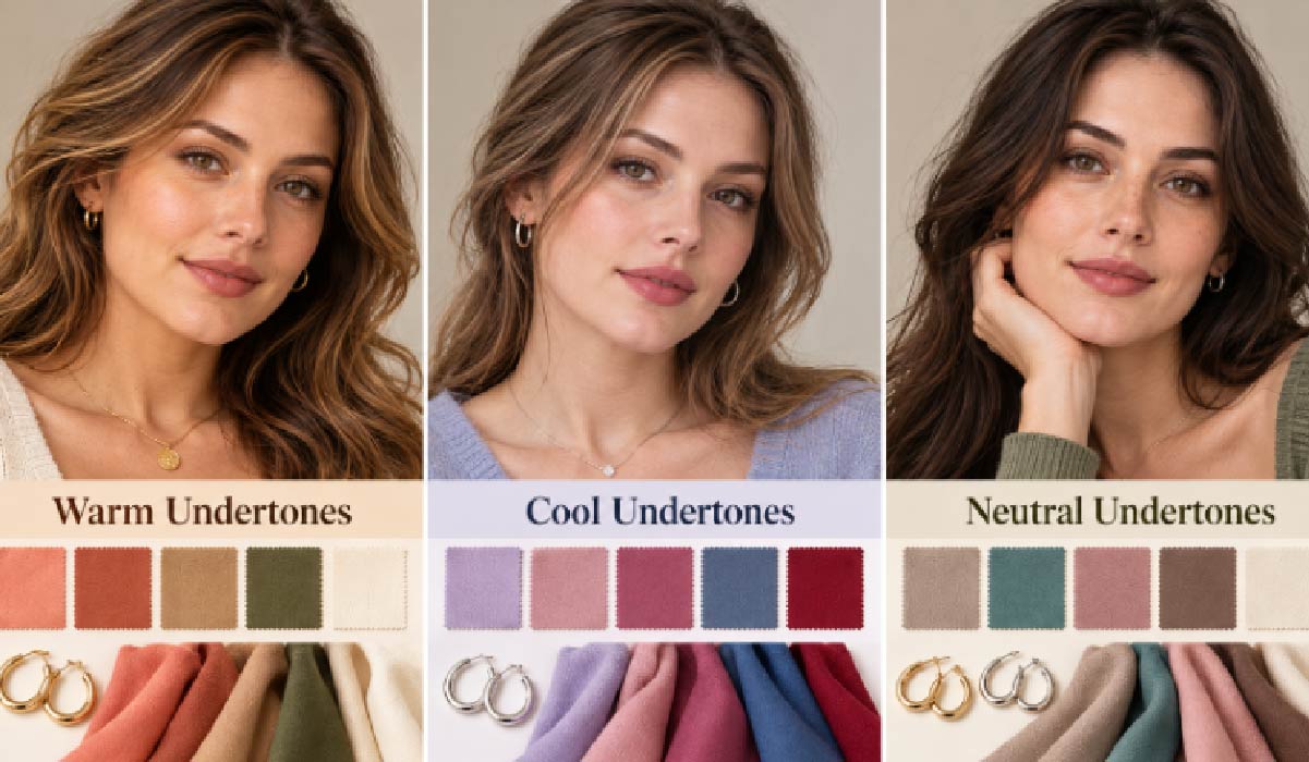
How Skin Undertones Influence Your Color Palette
Skin undertone describes the underlying color character of your complexion. Unlike surface skin tone, which may change with sun exposure, undertone generally remains relatively consistent.
Warm Undertones
Warm undertones often have golden, peachy, or yellow influences.
Colors such as coral, terracotta, camel, olive, and warm ivory may appear harmonious.
Cool Undertones
Cool undertones may have rosy, bluish, or cooler beige influences.
Lavender, dusty rose, cool berry, blue-based red, and slate blue may complement these features.
Neutral Undertones
Neutral undertones combine warm and cool characteristics.
People with neutral coloring may find both gold and silver jewelry flattering. However, color depth and saturation still influence which shades appear most balanced.
Olive skin can also have warm, cool, or neutral undertones.
Explore Your Personal Colors With Facefy
Identifying flattering colors can be challenging when your skin, hair, and eyes display overlapping characteristics.
Facefy offers appearance-analysis tools that help users explore facial characteristics, color analysis, and personalized beauty insights.
Its color analysis features provide a useful starting point for understanding how different shades relate to your natural coloring.
Rather than choosing colors entirely through guesswork, you can use these insights to explore potential wardrobe, makeup, and styling combinations.
Understanding Color Theory: How to Mix Paint for Hue, Value, and Chroma
Three color characteristics help explain why certain shades complement your appearance.
Hue: Warm vs. Cool
Hue describes a color’s position within the spectrum.
Warm colors include coral, mustard, and terracotta, while cool colors include lavender, icy blue, and blue-based pink.
Value: Light vs. Dark
Value describes how light or dark a color appears.
Powder blue and pale peach have lighter values, while navy, burgundy, and chocolate brown have deeper values.
Chroma: Bright vs. Muted
Chroma describes color intensity.
Bright colors include electric blue and vivid coral. Muted colors include sage green, dusty rose, and soft taupe.
Combining these characteristics helps create a balanced personal palette.
How Seasonal Color Analysis Helps Identify Your Best Colors
Seasonal color analysis organizes colors into four families: Spring, Summer, Autumn, and Winter.
The expanded 12-season system accounts for differences in temperature, value, and chroma.
Spring: Warm and Fresh
Spring palettes emphasize warmth, clarity, and freshness.
Common shades include peach, coral, golden yellow, warm turquoise, and fresh green.
Summer: Cool and Soft
Summer palettes favor cooler, softer colors.
Examples include dusty rose, lavender, powder blue, muted mauve, and soft navy.
Autumn: Warm and Earthy
Autumn palettes emphasize rich, grounded colors.
Terracotta, mustard, olive, rust, caramel, and chocolate brown are characteristic shades.
Winter: Cool and Bold
Winter palettes feature greater clarity, depth, or contrast.
Common colors include cobalt blue, emerald, fuchsia, burgundy, crisp white, and black.
These seasonal categories are styling references rather than strict beauty standards.
Build Your Personal Palette With Facefy
If you want to explore colors that complement your natural features, Facefy’s color analysis tool offers a relevant starting point for developing your personal palette.
Understanding potential color characteristics can help narrow down clothing, makeup, and accessory choices before experimenting with different combinations.
For more reliable comparisons, use photographs taken in consistent natural lighting and test suggested colors against real fabrics.
How to Create a Personal Color Palette That Works
Building an effective palette involves more than choosing attractive shades. Your colors should complement one another while remaining practical for everyday use.
Step 1: Choose Your Dominant Colors
Begin with shades that complement your natural coloring.
For example, someone who prefers warm, muted colors might choose olive or terracotta as a foundation.
Step 2: Understand Color Harmony
The color wheel provides several approaches to coordinating shades.
- Monochromatic: Different values of one hue.
- Analogous: Neighboring colors on the color wheel.
- Complementary: Opposite colors creating contrast.
- Triadic: Three evenly spaced colors.
These principles help create coordinated outfits and makeup combinations.
Step 3: Add Neutrals and Accent Colors
Choose versatile neutrals such as beige, navy, charcoal, cream, or chocolate brown.
Add accent colors that complement your dominant shades.
Step 4: Apply the 60-30-10 Rule
This design guideline suggests using approximately 60% dominant color, 30% secondary color, and 10% accent color.
The proportions are flexible and can help create visual balance in outfits.
Limited Palette vs. Rich Palette: Personal Color Palettes
A limited palette typically contains three to five coordinated colors.
It simplifies outfit planning, reduces competing visual elements, and makes shopping decisions easier.
A rich palette includes more shades, variations, and accent colors.
For example, a rich blue palette might combine powder blue, denim, slate, navy, and complementary neutrals.
Start with a limited core palette and expand as your styling needs develop.
How to Use Your Color Palette for Makeup
Lipstick and Blush
Warm palettes may coordinate with peach, coral, terracotta, and warm pink.
Cool palettes may complement rose, mauve, berry, and blue-based red.
Eyeshadow and Eyeliner
Warm brown, bronze, and gold can coordinate with warmer coloring.
Taupe, charcoal, plum, and cool brown may suit cooler palettes.
Makeup Intensity
Bright palettes can support vivid pigments, while muted palettes may look harmonious with softer finishes.
Foundation should match your actual complexion rather than a seasonal category.
Using Your Color Palette in Everyday Fashion
Colors worn closest to your face often have the strongest visual influence.
Prioritize tops, scarves, jackets, and accessories when exploring your palette.
Create a Capsule Wardrobe
Choose several coordinating neutrals and introduce complementary accent colors.
This makes it easier to create multiple outfits from fewer pieces.
Make Off-Palette Colors Work
You do not need to discard clothing outside your recommended palette.
Try wearing those colors farther from your face or pairing them with more harmonious shades.
Keep a Digital Color Reference
Save your preferred colors on your phone to compare shades while shopping.
Remember that screen settings and lighting can alter color appearance.
Common Personal Color Palette Mistakes
Assuming Hair Color Determines Everything
Natural hair color provides useful clues but cannot determine your palette independently.
Believing Everyone Looks Best in Black
Black works naturally with some palettes, while others may prefer charcoal, navy, or chocolate brown.
Relying Entirely on Online Quizzes
Digital assessments can be influenced by lighting, makeup, and camera processing.
Treating Your Palette as a Restriction
Your palette should inspire choices rather than prevent you from wearing colors you love.
Final Thoughts on Personal Color Palettes
A personal color palette provides a practical framework for coordinating makeup, clothing, and accessories.
By understanding undertones, hue, value, and chroma, you can make more confident styling decisions while maintaining your individuality.
The goal is not to follow color rules perfectly, but to discover combinations that complement your features and reflect your personal style.
